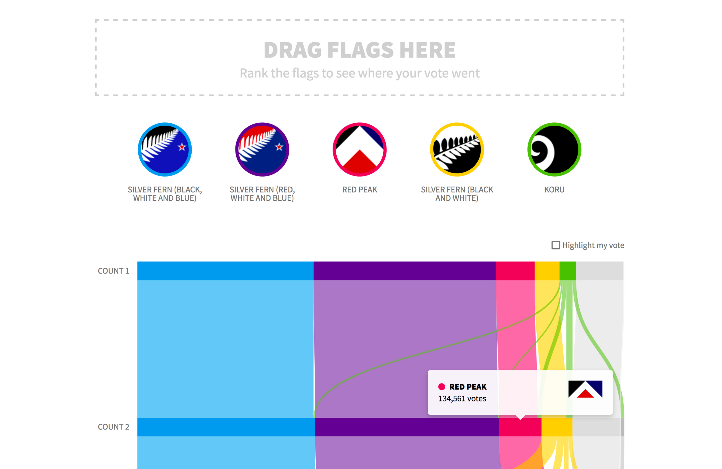
New Zealand Flag Graph
View visualisation →- Date
- 2016
- Category
- Web development,
- Data visualisation
- Tech
- JavaScript,
- D3,
- SVG
In 2015 and 2016, New Zealand voted on whether to change the country's flag. The first referendum, regarding which of the shortlisted options to pit against the current flag, was run using a preferential voting system. This resulted in some interesting trends in how people chose to rank the five options (or whether to rank them at all).
Using data from the New Zealand Electoral Commission, I visualised some of this through an interactive web-based chart, written primarily using D3.js. As well as aiming to provide a clearer picture of trends in the referendum results, I also used this as an opportunity to explore some new areas in my front-end development process, including using ES6 and Browserify.
